
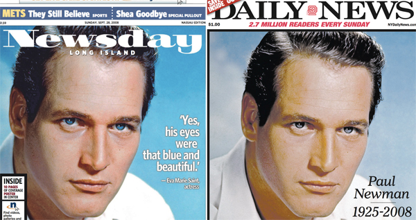
Was Newsday wrong in bringing out the blue in this photo in order for it to accompany the quote? You decide.
Adobe Photoshop is used widely in the newspaper industry for the cropping and color toning of news photographs. It's also frequently used in design-heavy pages employed by most newspapers these days.
The program has legitimate uses, but it can be abused, too.
We've heard of many controversies in journalism in which photographers have doctored photos for dramatic effect. One of the more recent ones is when Reuters admitted to darkening and increasing the volume of smoke billowing over Beirut in 2006. It was a particularly poor cloning job, so it's no wonder consumers and media critics saw through it.
This example, which I believe is exclusive to The Offlede, is less egregious.
It would appear that a newspaper has adjusted the colors of a photo for the sake of design. Newsday's Sept. 28 cover about the death of Paul Newman also included a quote of actress Eva Marie Saint saying "Yes, his eyes were that blue and beautiful." It seems that the blue hues in the photo were enriched to make the quote work.
The Daily News in New York City used the same photo on its cover, but it looks quite different. Newman's eyes are more gray than blue, and the background similarly isn't as colorful in the Daily News version.
In the original, which The Associated Press ran on its wires, the hues are grayish-blue.
On the Newsday cover, the most telling indicator is Newman's hair. The highlights are gray in the original, but in the Newsday photo, they are blue.
Toning a photo so that it corresponds with a text element, such as Saint's quote, is a questionable practice. I asked a co-worker, and she agreed that Newsday was walking a fine line with this cover. We both said Newman's eyes are the same aqua marine of the Atlantic Ocean here in Central Florida.
What do you think?

3 comments:
Hey, so I wrote this on a discussion board for one of my grad classes a good 12 hours before the Offlede. You stole it from me. Just kidding. I actually saw these side by side in a Dunkin' Donuts, left my spot in line (on a Sunday, nonetheless) to investigate these troublesome hues. That's when you know I paid too much attention in ethics class -- when it gets in the way of my iced coffee.
I think I took more ethics classes than anything else. It's the real overkill part of journalism education.
Yeah, too much manipulation here.
If you are talking photo illustration that is clearly meant to be a photo illustration, that is one thing.
This doesn't even look real to me.
What was wrong with the real blue of his eyes.
Take it from me, that color is far more attractive than the fake aquamarine.
Post a Comment