
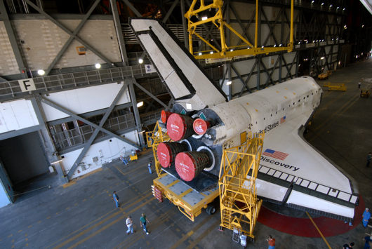
The "D" on shuttle Discovery is in the sans-serif Helvetica font and is the size of a small person. (Photo by NASA)
Discovery will launch at 5:02 p.m. Saturday from Kennedy Space Center. But before it goes up, there's an important piece of trivia you should know.
The typeface on the shuttle is Helvetica.
That's right. NASA has no room for showing off - no flourishes, no serifs. Plain, old-fashion Helvetica.
Serifs are obviously not aerodynamic. The choice of Helvetica for the shuttle was not for aesthetic purposes: It was clearly an engineering decision. If NASA went with a serif font - say, Garamond or Georgia (used on The Offlede) - the shuttle wouldn't have the power to make it into orbit.
Though unpretentious, Helvetica is an attention-grabber. I used to use it as a headline font for special newspaper layouts. So, it's also obvious that NASA used Helvetica to make sure that, if they're out there, the aliens would see the shuttle.
Discovery's liftoff will be the first daylight launch since I got my telephoto lens. Unfortunately, I'll be at work during the launch and will have a distant view of the event. I'll still shoot it, but my 200mm Nikkor isn't powerful enough to pick up the Helvetica all the way from Melbourne.
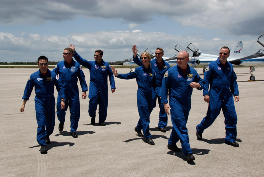
Discovery astronauts wave at reporters, who don't care what the shuttle font is. (Photo by NASA)


2 comments:
Aerodynamic? Yeah, that's why NASA chose it. Because it's not like Helvetica is used on nearly every other government-related structure or document. It's the No. 1 Choice for Uncle Sam.
By the way, did you ever see the movie "Helvetica"? (I missed it but would love to watch it sometime.)
~WN
I'm still trying to memorize the 61 things we're supposed to know about the Discovery astronauts.
Post a Comment